The Times Embraces Data Visualization
![]() Data visualization is not yet mainstream, but it continues to pop up, giving users a better understanding of complex views of data.
Data visualization is not yet mainstream, but it continues to pop up, giving users a better understanding of complex views of data.
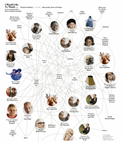
 The New York Times has begun to integrate visual maps more and more into their content. Today’s Times includes a visual map showing links between Academy Award winners and the parties they thanked, including mom, the Academy, God, their fellow nominees and even the “People of Uganda, Argentina or Bavaria” (had Borat won, we could have added the People of Kazakhstan).
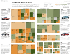
In yesterday’s Business Section, accompanying an article on Chrysler’s struggles, the Times used a tree map showing how truck sales were slipping.
When used properly, data visualization tools allow the author (designer?) to convey much more information than you could with tabular displays, charts or graphs. I’m glad to see their adoption increase.


Comments